
For those in any doubt, CAPE ratio says we’re in a bubble.
We arrived here in the second half of 2019. Since then, investor caution has diminished and has been replaced by rampant speculation across stocks and a range of alternative instruments. The long-run CAPE ratio chart below is a clear expression of our current bubble territory.
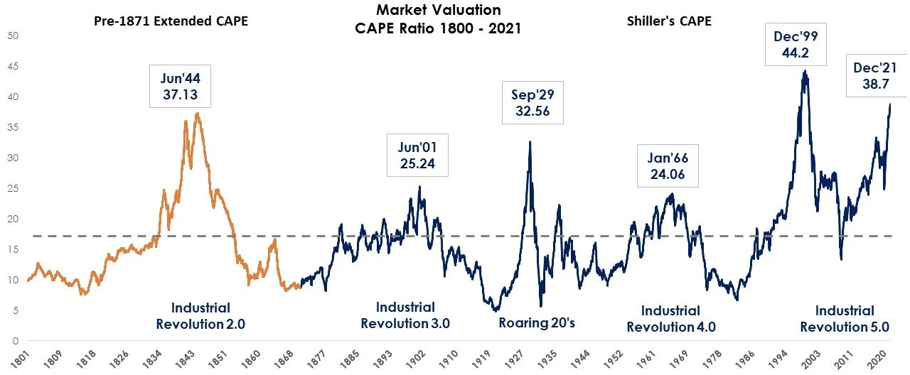
Sources: Global Financial Data (GFD); Professor Shiller, IFC at Yale (Cowles), Two Centuries Investments
The CAPE ratio, the popular market valuation metric, created by Professor Shiller, shows cyclically adjusted price-to-earnings ratios. It currently stands at 38.7. This is very high in the context of historical levels, exceeding all prior peaks except the Dotcom.
Bubbles, unlike more benign hot markets, are likely to end in a market crash.
However, while CAPE data tells us that danger lies ahead, it does not tell us exactly when the danger will manifest or what action to take. The map is not the territory. Timing the market based on CAPE is unlikely to succeed.
Acting based on the warning sign alone will likely contribute to the huge return gap between dollar-weighted and time-weighted returns of a portfolio. The odds of getting out of the market too early and missing out on valuable compounding are generally stacked against the investor.
But, that doesn’t mean that doing nothing is the right answer. When CAPE is yelling, it’s critical to have a plan for what to do (if and) when the market goes south.
Any investment professional that uses CAPE in some way to make investment decisions is using some level of dynamic decision making. The key question is whether this dynamism (based on situational judgment or a more systematic approach) adds value.
In our Two Centuries Dynamic Balanced strategy, we rely on a model that systematically reallocates between reliable asset classes based upon centuries of historical signals. If I didn’t have this investment strategy, I would be feeling a lot more anxious staring at today’s CAPE ratio. So, even though I believe that we’re in bubble territory, I’m not taking any specific action beyond what has already been programmed into our approaches.
My confidence in Dynamic Balanced comes from its reliance on a long-run history. When working with a long history (and systematic investing in general) we are not aiming for ultra-high precision but rather searching for insights that are accurate enough to be better than random. While this doesn’t sound particularly impressive on the surface, a small level of accuracy can be extremely important over the long run. When it comes to compounding returns over several decades, it’s the difference between an exponentially higher outcome and something far less adequate.
What Can We Learn from CAPE’s Long-Run History?
CAPE’s available history goes back to 1871 which is when earnings data was first hand-collected by The Cowles Commission for Research in Economics at Yale. I was able to extend this ratio further back to 1800 to find insights not immediately apparent in the data from 1871. If you’re a regular reader of this blog, you’ll know that this is an exercise I like to undertake with various data sets because history often repeats itself (albeit in often surprising ways). Taking a broader perspective can help reduce investor anxiety by providing context for the present. If you’d like to check out some other historical extensions take a look at the blogs on Price Momentum and Value Factors, Commodity Factors, and Risk Parity. And, if you’d like to know more about the process of extending this data back, see the endnotes to this blog.
From the extended CAPE history analysis, three observations are particularly apparent:
The current market valuation is the second most expensive market since 1800. And it’s less than a 15% market move away from becoming the first. This is the reason why I am comfortable calling the current market a bubble.
CAPE cycles are mean-reverting. However, this mean reversion does not only occur as a result of crashing market prices, it can also result from periods of modest market returns where earnings growth catches up and restores the valuation multiple. This second outcome is one of the reasons why selling stocks altogether leads to missed compounding. The other reason is that valuation ratios get you in and out too early.
Any attempt to establish a simple threshold rule to go in and out of the market based on CAPE ratio appears impossible since its exact path appears different every time.
Although during several periods in history an extremely high CAPE ratio was followed by negative stock minus bond returns, CAPE is far from a crystal ball. In fact, so far I have not been able to extract any practical forecasting utility from it. Bubbles are infrequent and each instance is unique, not following simple pre-determined threshold levels. Today’s profit margins, for example, are higher than they have been historically, and interest rates are lower than, say, during the 1999 peak.
CAPE is not a crystal ball.
Let me reiterate that the map is not the territory. No matter how elegant a chart may be or how easy it is to draw conclusions in hindsight, it appears impossible to design a rule for the value of CAPE that would reliably predict an actionable underperformance of stocks versus bonds in the future.
For example, if like most investors who use CAPE, you had calibrated a threshold using the 1929 period, you would have traded out of the market too early in the subsequent two mega bull markets (the 90’s and the current one). On the other hand, if you did use the pre-1871 history shown here, then it’s likely you would have been more patient before exiting both of these bull markets too early. This shows that inherently such threshold rules are unstable and unreliable.
So, even though 10 years from now researchers will point to some short interval in the current bull market where CAPE reached its peak and the subsequent market returns were negative, such future, ‘look-ahead-biased’ backtests will likely fail to disclose the astronomical cost of missed compounding that resulted from many early and incorrect sell-offs, and the practical infeasibility of exiting the market again, at the perfect top, after an investor has already sold it a few years back.
Therefore, while overlaying the on-the-surface reasonable yet in-real-time unachievable 10-year forward market returns, looks like a forecast, it’s not. For example, the following frequently cited regression is unachievable in practice: a regression of monthly 10-year forward returns (Y variable) on CAPE ratios (X variable) produces the astronomically high t-statistic of 24! and R-squared value of 27%. But, in reality, the 10-year return cannot happen every month. And for any given investor, it can happen only once every ten years, not every month!
Investors are generally better holding on throughout the entire market cycle than jumping out too early.
What the current CAPE level says about the market is that it’s expensive and that future expected returns are likely to be lower than usual. However, this same statement has already been frequently mentioned over the past 7-10 years and investors that acted on that statement have missed one of the best market decades.
For example, if a theoretical investor exited the market in June 2014, when the CAPE ratio reached 25 - a threshold that many consider expensive, he would have missed on a 171% subsequent market rally through October 2021. The market would need to drop -63% from here for this investor to just breakeven on that 2014 exit. Although such a market move can theoretically happen, the odds of this investor successfully staying out of the market and not jumping back during the past seven years are practically low, unless such a deep contrarian approach is this investor’s core philosophy.
Although CAPE is often used by finance professionals to forecast low expected returns (and subsequently recommend the lucrative alternative diversification solutions), the real underlying problem that CAPE highlights is not the low expected returns. It is the fact that very expensive markets like the one today are typically followed by crashes which generally lead to anxiety and investors selling out of their strategies. But by trying to avoid the crash without a tested approach, or by chasing diversifiers, investors miss out on long-term compounding.
Selling just a few months too early or too late can hugely impact future returns. For example, selling out of stocks and buying bonds during most of the 1995-1998 bubble would have generated no relative gains over the next decade, and only following equity market top in early 2000, which can only be understood with hindsight, did stocks underperform bonds by a 10% per year over the next ten years.

Sources: Global Financial Data (GFD); Professor Shiller, IFC at Yale (Cowles), Two Centuries Investments
In the graph above, the orange periods highlight when the future 10-year return of stocks minus bonds is negative. This means that once you decide to sell stocks, you have to wait another 10 years before measuring the results and reallocating again. You cannot sell stocks in 1997 (too early, stocks outperformed bonds), and then magically sell stocks again in 1999 (-10% / year). In real-time, you have one shot at moving out of equities and the odds of timing it successfully based on CAPE are extremely low.
Importantly, the graph also demonstrates many periods where the CAPE ratio peaked but the future stock returns still outperformed the bond returns like in 1841, 1901, and 1937 to name a few. And there are a handful of periods of low CAPE which were followed by a decade of stocks underperforming bonds.
In sum, trying to follow CAPE hurts investors. But, CAPE data and other market indicators can help raise fundamental questions about the resilience of your investment process.
So, What’s the Solution?
One option is to accept the occasional large drawdown (30-60%) of a static asset allocation portfolio like a 60/40 and continue to rebalance it back to target as its asset class weights shift in response to relative return differences.
But let’s face it, we are not wired to be unemotional about losses. This is why dynamic asset allocation, especially when compared to static asset allocation, can help.
Long historical data allows us to test our dynamic strategies to see how they would have fared in the past so that we can avoid significant underperformance in the future. Although we cannot solve for all of the circumstances that lead to a particular bubble, we can use some signals to smooth out returns and perform better than a static allocation which is completely tethered to the ups and downs of the allocation.
Our strategy is not built to outperform traditional static 60/40 allocations over every single decade and every market cycle. What it is built to do is keep investors in the market over the duration of time necessary to achieve adequate capital growth. It does this by performing much better than the static option during the times when investors are most likely to pull out of the market and sit in cash, waiting for the (theoretical) opportune moment to reinvest and, inevitably, missing it. So, yes, CAPE is warning us of danger ahead, but we’re sleeping at night because we know that our dynamic approach is acting on a plan.
***
End Notes: How I Extended the Data
Data hand-collected data by Global Financial Data (GFD) allowed the extension back to 1832. The starting point was GFD’s price-to-earnings data for the railroads industry, which by 1870 comprised 76% of the total U.S. market capitalization. As a result, the valuations of the relevant companies were representative of the overall market. Using this data we extended Shiller’s CAPE “spreadsheet” backwards, by indexing the relevant EPS, prices, and inflation values.
To go further back beyond 1832, we used dividend growth rates as a proxy for historical EPS values. In other words, we backcasted historical EPS using dividend growth rates. Over the entire sample, dividends have grown at a similar pace as earnings, albeit with different volatilities, especially around recessions. However, for the period from 1800 to 1832, earnings were mostly distributed to shareholders which means it is reasonable to use dividend growth rates to estimate earnings growth.
Admittedly, there are a lot of approximations and assumptions. However, we consider the analyses and subsequent insights to be helpful.